
Policy Implementation Notice 2026-01: Use of colours associated with the governing political party in Government of Canada communications
1. Date of issue
This Policy Implementation Notice was issued on June 3, 2026.
2. Application
This Policy Implementation Notice applies to departments and other portions of the federal public administration as set out in Schedules I, I.1 and II of the Financial Administration Act, unless excluded by specific acts, regulations or orders in council.
3. Purpose
This notice is intended to provide guidance to departments to ensure that decisions regarding the use of colour in communications products and activities align with the definition of non-partisan communications in the Policy on Communications and Federal Identity. It outlines considerations when planning or evaluating visuals and creative materials.
The intent is not to restrict creativity but to provide a common framework for assessing colour prominence and identifying steps to maintain compliance with the Policy on Communications and Federal Identity. Applying this guidance helps departments avoid perceptions of partisan bias and supports public trust and confidence in government communications.
4. Context
Non-partisan communications is defined in the Policy on Communications and Federal Identity. It states that in the context of all Government of Canada communications products and activities, non-partisan means:
- objective, factual and explanatory;
- free from political party slogans, images and identifiers; bias; designation; or affiliation;
- that the primary colour associated with the governing party is not used in a dominant way, unless an item is commonly depicted in that colour;
- that advertising is devoid of any name, voice or image of a minister, member of Parliament or senator.
5. Interpretation
The following is intended to help departments ensure the primary colour associated with the governing party is not used in a dominant way when creating communications products and activities.
Exceptions
In the definition of non-partisan communications, what is meant by items “commonly depicted in that colour”? This means that the restrictions on the use of colour do not apply to a specific object if it is shown in its natural state and natural colour. The following examples are common situations where this consideration may be encountered:
- the colour used in common depictions of an object (e.g., orange traffic cone, red poppy, blue recycling box);
- photo or illustration of Crown assets with a fixed colour for reasons such as tradition, safety, international convention or industry standard (e.g., blue uniforms of the Royal Canadian Navy, RCMP red serge, orange search-and-rescue jumpsuits, etc.);
- for national events and celebrations (e.g., Canada Day, Team Canada, etc.) for which the official colours of the National Flag of Canada (red and white) feature prominently in the branding; or
- advertising campaigns in international markets intended to promote Canada to non-Canadian audiences.
Identifying designated party colours
Each federal political party uses a primary colour to represent its identity when communicating with the public. This colour is a key element of the party’s branding and visual identity, appearing prominently in materials such as communications, election signs, websites, and other promotional assets.
While official party status may change, the largest national parties are listed below along with their designated primary colour:
- Bloc Québécois (light blue)
- Conservative Party of Canada (dark blue)
- Liberal Party of Canada (red)
- New Democratic Party (orange)
- Green Party of Canada (green)

Figure 1: Designated party colours
Designated party colours: 1. Bloc Québécois (light blue); 2. Conservative Party of Canada (dark blue); 3. Liberal Party of Canada (red); 4. New Democratic Party (orange); 5. Green Party of Canada (green).
Gauging colour predominance
For the purposes of this guidance, the concept of a predominant colour refers to a colour that is present in a communications product or activity as the primary, main colour element. There is no fixed threshold at which a colour becomes predominant; rather, it exists on a gradual scale. A predominant colour is one that is most likely to draw the attention of a typical viewer.
When assessing whether a colour associated with the governing party is being used in a predominant way, several factors need to be considered. Each factor contributes differently to the visual prominence of a colour and can create conditions where it is perceived as predominant.
1. Colour range
Colour exists on a continuous spectrum, encompassing different hues (e.g., green, red, blue) as well as variations in tints (lighter) and shades (darker). Perception of colour and the degree of similarity between colours can vary from person to person.
For this reason, it is useful to consider the full range of a colour, including its lighter and darker tints and shades, when assessing whether a political party’s colour is being used in a predominant way in communications products and activities.
The following graphic illustrates the range of hues for blue, green, orange and red within the full colour spectrum. The colour ranges shown in figure 2 are intended as broad visual groups only and do not represent precise technical specifications or exact boundaries between colours.

Figure 2: Colour range
A wide horizontal bar at the bottom of the image depicts a continuous spectrum of colour hues ranging from violet (left) through blue, green, yellow, orange, and red (right). Above this bar are five solid-colour squares spaced along the top of the image. Each square represents the main colour of one of Canada’s major political parties (from left to right: dark blue, light blue, green, orange, and red). Thin black lines extend from the bottom of each square down to the part of the spectrum that matches the potential perceived range of its hue.
2. Amount and prominence of colour
The visible amount of a colour is the most basic factor in assessing its predominance. For digital products, consider the duration that a colour appears on screen as part of the overall assessment.
As shown in figure 3 below, even a small amount of colour can be considered predominant if it is the only colour used aside from black and white. In such cases, the absence of other colours makes the featured colour—such as green—stand out prominently.
Another consideration relates to how the colour is positioned. From a design perspective, items placed near the top or centre of a layout typically appear more prominent, as viewers are naturally drawn to these areas rather than the edges or periphery. As shown illustrations 2 and 3 of figure 3 below, the placement and use of a single colour can quickly make green predominant.
Unless an item falls under the exception list, departments should avoid situations where the governing political party’s primary colour is the only colour used in communications products or activities.

Figure 3: Amount and prominence of colour
The image shows three simplified document mock-ups placed side by side in a row and numbered 1, 2 and 3 across the top.
Layout 1 (left): A white page is mostly filled with grey horizontal lines representing dense body text from top to near the bottom. Across the bottom of the page there is a solid green horizontal band, like a wide footer or banner.
Layout 2 (centre): A white page displays a large green circle with a thinner green ring inside it, centred near the top of the page. Below this circular graphic are two short columns of grey horizontal lines representing blocks of text.
Layout 3 (right): A white page has the words “Lorem Ipsum!” in large green letters near the top, representing a bold title or heading. Below the heading is a single block of grey horizontal lines representing a short paragraph of text.
3. Balancing with other colours
When the primary colour associated with the governing party is being used with other colours, assess whether it is being used predominantly. This can be done by roughly estimating the percentage of the overall area used by each colour. Predominance of a colour can be offset by using other colours. In the squares below, green would not be considered dominant as it is balanced with the use of other colours.
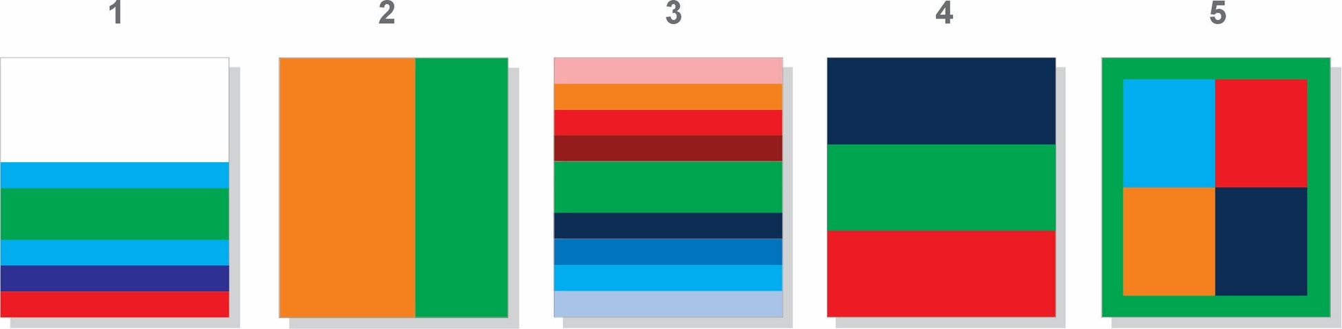
Figure 4: Balancing with other colours
The image shows five numbered one-page examples in a row, labelled 1 to 5. Each page contains blocks of colour, always including green, to illustrate different proportions of green compared with other colours. They are, from left to right:
Example 1: A mostly white page with five narrow horizontal stripes along the bottom edge. From bottom to top, the stripes are red, dark blue, light blue, green and light blue. The green stripe is twice as thick as the others.
Example 2: A page divided vertically into orange (left) and green (right).
Example 3: A page filled with ten horizontal stripes of equal height and various colours. From top to bottom the colours are light red, orange, bright red, dark red, green, another identical green, navy blue, bright blue and light blue. The green stripe is wider as there are two placed together centrally.
Example 4: A page divided into three equal horizontal bands: dark blue (top), green (middle), and red (bottom).
Example 5: A page with a thick green border framing an inner rectangle divided into four equal rectangles: light blue (top left), bright red (top right), orange (bottom left) and dark blue (bottom right).
Summary of best practices
- Consider all factors outlined in this guidance when assessing predominant use of colour.
- Choose neutral or balanced colour palettes to help avoid any perception of dominant use of the governing political party’s colour in Government of Canada communications products and activities.
- If you use a colour associated with the governing political party, be mindful of whether it could be considered predominant—including related tints and shades within the same colour palette.
- Avoid layouts where the governing political party’s primary colour is the main visual element unless the item is commonly depicted in that colour.
6. Related policy instruments
7. Enquiries
Employees of federal departments may contact their departmental Head of Communications for information.
Members of the public may contact Treasury Board of Canada Secretariat Public Enquiries for information.